/* eslint-disable react/no-unescaped-entities */
/* ============================================================
   Sections — Part 1
   Hero · Problem · Insight · Sustainability · Solution
   ============================================================ */

// ============================================================
// HERO
// ============================================================
function Hero() {
  return (
    <section className="hero">
      <style>{`
        .hero {
          position: relative;
          min-height: 100vh;
          padding: 120px var(--pad-x) 80px;
          display: grid;
          grid-template-columns: minmax(0,1.05fr) minmax(0,0.95fr);
          gap: clamp(20px, 4vw, 80px);
          align-items: center;
          max-width: var(--maxw);
          margin: 0 auto;
          overflow: hidden;
        }
        .hero-eyebrow {
          display: flex;
          gap: 14px;
          align-items: center;
          margin-bottom: 32px;
        }
        .hero-pill {
          display: inline-flex;
          align-items: center;
          gap: 8px;
          height: 32px;
          padding: 0 14px;
          border-radius: 999px;
          border: 1px solid var(--line);
          background: rgba(255,255,255,0.02);
          font-family: var(--f-mono);
          font-size: 11px;
          letter-spacing: 0.12em;
          text-transform: uppercase;
          color: var(--t-2);
        }
        .hero-pill .dot { width:6px; height:6px; border-radius:50%; background: var(--uber-cash-blue); }
        .hero h1 {
          font-family: var(--f-display);
          font-weight: 700;
          letter-spacing: -0.04em;
          line-height: 0.93;
          font-size: clamp(56px, 9vw, 132px);
          margin: 0 0 28px;
          text-wrap: balance;
        }
        .hero h1 em {
          font-style: normal;
          color: var(--t-3);
          font-weight: 500;
        }
        .hero-sub {
          font-size: clamp(17px, 1.45vw, 22px);
          line-height: 1.45;
          color: var(--t-2);
          max-width: 560px;
          margin: 0 0 40px;
          text-wrap: pretty;
        }
        .hero-sub b { color: var(--t-1); font-weight: 600; }
        .hero-ctas { display: flex; gap: 12px; flex-wrap: wrap; margin-bottom: 56px; }
        .hero-stats {
          display: grid;
          grid-template-columns: repeat(4, 1fr);
          gap: 0;
          border-top: 1px solid var(--line);
          padding-top: 28px;
        }
        .hero-stat {
          padding-right: 16px;
          border-right: 1px solid var(--line);
        }
        .hero-stat:last-child { border-right: none; padding-right: 0; }
        .hero-stat-k {
          font-family: var(--f-mono);
          font-size: 10px;
          letter-spacing: 0.14em;
          color: var(--t-4);
          text-transform: uppercase;
          margin-bottom: 6px;
        }
        .hero-stat-v {
          font-family: var(--f-display);
          font-weight: 600;
          letter-spacing: -0.015em;
          font-size: clamp(13px, 1.15vw, 16px);
          color: var(--t-1);
        }
        .hero-can {
          position: relative;
          justify-self: center;
          width: clamp(280px, 38vw, 480px);
          aspect-ratio: 1024/1536;
          filter: drop-shadow(0 60px 80px rgba(0,0,0,0.6)) drop-shadow(0 20px 30px rgba(95,179,255,0.06));
        }
        .hero-can img { width: 100%; height: 100%; object-fit: contain; }
        .hero-can::after {
          content: "";
          position: absolute;
          bottom: -40px;
          left: 50%;
          transform: translateX(-50%);
          width: 70%;
          height: 80px;
          background: radial-gradient(ellipse at center, rgba(255,255,255,0.05), transparent 70%);
          filter: blur(20px);
          z-index: -1;
        }
        .hero-anno {
          position: absolute;
          font-family: var(--f-mono);
          font-size: 10px;
          letter-spacing: 0.16em;
          text-transform: uppercase;
          color: var(--t-3);
          display: flex;
          align-items: center;
          gap: 8px;
        }
        .hero-anno::before {
          content: "";
          width: 32px; height: 1px;
          background: var(--line-strong);
        }
        .hero-anno.right::before { display: none; }
        .hero-anno.right::after {
          content: "";
          width: 32px; height: 1px;
          background: var(--line-strong);
        }
        .hero-anno-1 { top: 18%; right: -180px; }
        .hero-anno-2 { top: 44%; right: -180px; }
        .hero-anno-3 { bottom: 12%; right: -180px; }
        @media (max-width: 980px) {
          .hero {
            grid-template-columns: 1fr;
            padding-top: 100px;
            min-height: auto;
            gap: 40px;
          }
          .hero-stats { grid-template-columns: repeat(2, 1fr); gap: 20px 0; }
          .hero-stat:nth-child(2) { border-right: none; }
          .hero-anno { display: none; }
        }
      `}</style>
      <div>
        <Reveal>
          <div className="hero-eyebrow">
            <span className="hero-pill"><span className="dot"/>INAUGURAL RIDESHARE CATEGORY</span>
            <span className="hero-pill">PROPOSAL · MAY 2026</span>
          </div>
        </Reveal>
        <Reveal delay={80}>
          <h1>
            In every hand.<br/>
            <em>The moment they're<br/>deciding how to move.</em>
          </h1>
        </Reveal>
        <Reveal delay={140}>
          <p className="hero-sub">
            <b>150,000 co-branded cans a year.</b> In hand at premier California venues — at the moment riders are deciding how to move, and how to get the food they didn't eat. One can. One scan. Three live experiments across Uber's funnels.
          </p>
        </Reveal>
        <Reveal delay={180}>
          <div className="hero-ctas">
            <a href="#offer" className="btn btn-primary">Start the pilot — $100K <Icon name="arrow" size={14}/></a>
            <a href="#testing" className="btn btn-ghost">See the A/B story</a>
          </div>
        </Reveal>
        <Reveal delay={220}>
          <div className="hero-stats">
            <div className="hero-stat">
              <div className="hero-stat-k">Pilot</div>
              <div className="hero-stat-v">$100K · 50K cans · 90d</div>
            </div>
            <div className="hero-stat">
              <div className="hero-stat-k">Funnels measured</div>
              <div className="hero-stat-v">Rides · Eats · Uber One</div>
            </div>
            <div className="hero-stat">
              <div className="hero-stat-k">Annual cans</div>
              <div className="hero-stat-v">150K+ at anchor</div>
            </div>
            <div className="hero-stat">
              <div className="hero-stat-k">Attribution</div>
              <div className="hero-stat-v">Multi-funnel · first-party</div>
            </div>
          </div>
        </Reveal>
      </div>
      <div style={{ position: "relative" }}>
        <div className="hero-can">
          <img src="assets/uber_can_front.png" alt="Uber co-branded water can" draggable="false"/>
          <div className="hero-anno hero-anno-1 right">
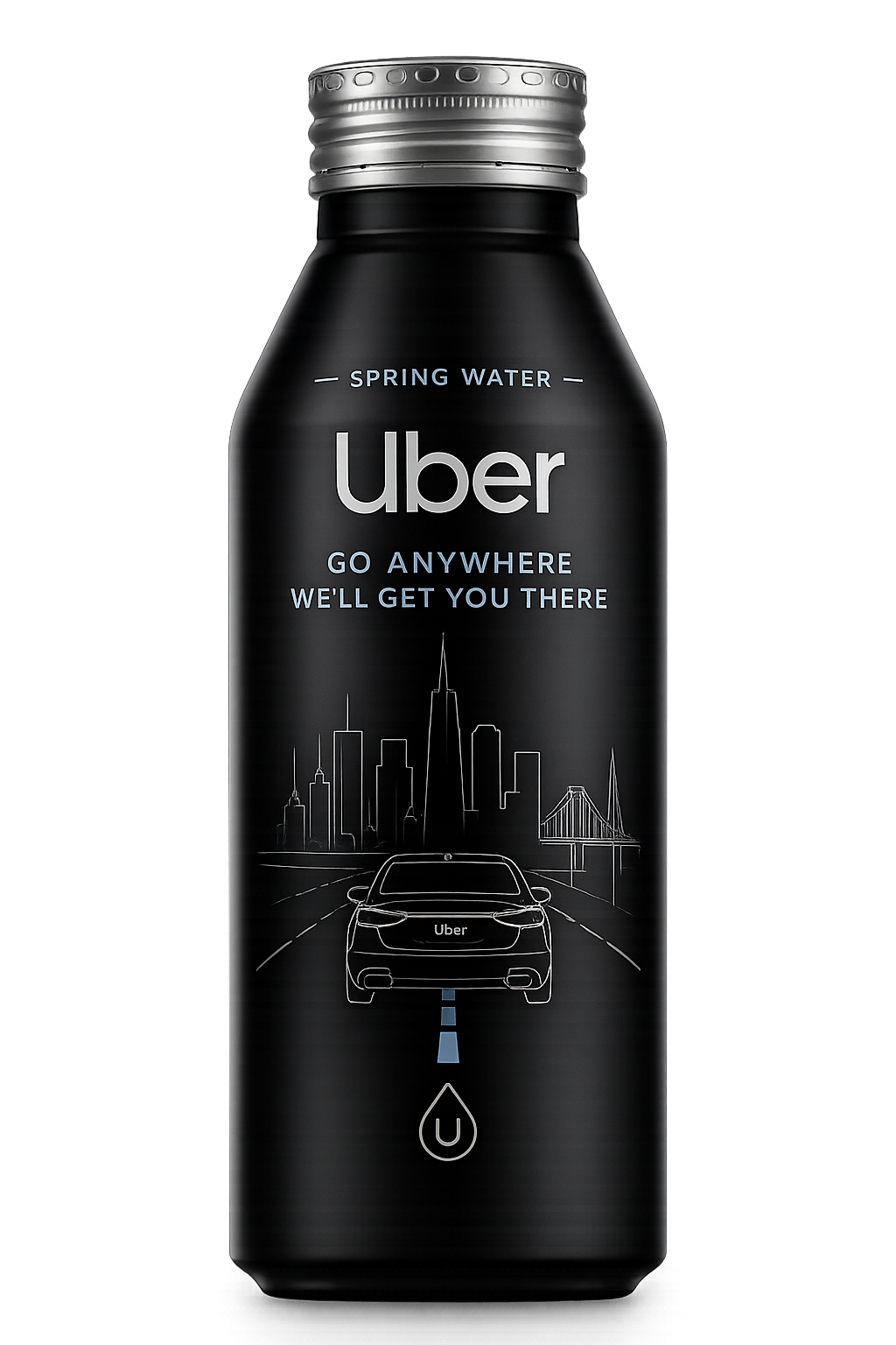
CO-BRANDED · 16 FL OZ</div>
          <div className="hero-anno hero-anno-2 right">~10 MIN IN-HAND DWELL</div>
          <div className="hero-anno hero-anno-3 right">QR · VARIANT-TAGGED</div>
        </div>
      </div>
    </section>
  );
}

// ============================================================
// PROBLEM
// ============================================================
function Problem() {
  return (
    <section className="section" id="problem">
      <style>{`
        .prob-grid {
          display: grid;
          grid-template-columns: 0.85fr 1.15fr;
          gap: clamp(32px, 6vw, 96px);
          align-items: start;
        }
        .prob-lede {
          font-family: var(--f-display);
          font-weight: 600;
          font-size: clamp(34px, 4.4vw, 64px);
          line-height: 1.02;
          letter-spacing: -0.025em;
          text-wrap: balance;
        }
        .prob-lede span { color: var(--t-3); font-weight: 500; }
        .prob-body p { font-size: clamp(16px, 1.25vw, 19px); line-height: 1.55; color: var(--t-2); }
        .prob-body p + p { margin-top: 20px; }
        .prob-body b { color: var(--t-1); font-weight: 600; }
        .prob-strike {
          display: inline-block;
          padding: 4px 10px;
          border: 1px solid var(--line);
          border-radius: 6px;
          font-family: var(--f-mono);
          font-size: 12px;
          letter-spacing: 0.04em;
          color: var(--t-3);
          text-decoration: line-through;
          text-decoration-color: rgba(255,255,255,0.4);
        }
        @media (max-width: 880px) {
          .prob-grid { grid-template-columns: 1fr; gap: 36px; }
        }
      `}</style>
      <div className="container">
        <Reveal>
          <div className="eyebrow" style={{ marginBottom: 32 }}>THE PROBLEM</div>
        </Reveal>
        <div className="prob-grid">
          <Reveal>
            <div className="prob-lede">
              Uber pays for impressions.<br/>
              <span>Nobody can attribute them.</span>
            </div>
          </Reveal>
          <Reveal delay={120}>
            <div className="prob-body">
              <p>
                Uber already pays for <b>brand-in-environment</b> — main stages, stadium signage, presenting sponsorships, broadcast pre-roll. Each of those is real money, and none of them lives in someone's hand. None of them attributes to a ride, an order, or a membership.
              </p>
              <p>
                The post-event moment is the highest-intent rideshare moment of the night. <b>Tens of thousands of people decide how to move in the same fifteen minutes.</b> Today, Uber competes for that moment with a generic in-app push.
              </p>
              <p>
                And it's not just rides. The same person, on the same trip home, is deciding what to eat. A different funnel. Same surface. <b>One brand moment. Three open funnels.</b>
              </p>
              <div style={{ display: "flex", gap: 10, flexWrap: "wrap", marginTop: 28 }}>
                <span className="prob-strike">main-stage signage</span>
                <span className="prob-strike">LED rotation</span>
                <span className="prob-strike">CTV pre-roll</span>
                <span className="prob-strike">presenting sponsor logo</span>
              </div>
            </div>
          </Reveal>
        </div>
      </div>
    </section>
  );
}

// ============================================================
// INSIGHT
// ============================================================
function Insight() {
  const stats = [
    { k: "PER BRANDED TOUCHPOINT", v: "$2.00", sub: "fully loaded — production, distribution, attribution" },
    { k: "ANNUAL CANS AT ANCHOR",  v: "150K+",  sub: "premier California venues, 12-month run" },
    { k: "AVG. IN-HAND DWELL",      v: "~10m",   sub: "more than any LED rotation, any CTV ad" },
    { k: "FUNNELS ATTRIBUTABLE",    v: "3",      sub: "rides · Eats · Uber One — same scan" },
  ];
  return (
    <section className="section section--light" id="insight">
      <style>{`
        .insight-grid {
          display: grid;
          grid-template-columns: 1fr 1fr;
          gap: clamp(36px, 6vw, 96px);
          align-items: start;
        }
        .insight-stats {
          display: grid;
          grid-template-columns: 1fr 1fr;
          gap: 1px;
          background: var(--line-ink);
          border: 1px solid var(--line-ink);
        }
        .insight-stat {
          background: var(--paper);
          padding: 28px 24px;
        }
        .insight-stat-k {
          font-family: var(--f-mono);
          font-size: 10px;
          letter-spacing: 0.16em;
          text-transform: uppercase;
          color: var(--tk-3);
          margin-bottom: 14px;
        }
        .insight-stat-v {
          font-family: var(--f-display);
          font-weight: 700;
          letter-spacing: -0.03em;
          font-size: clamp(40px, 4.5vw, 64px);
          line-height: 1;
          color: var(--ink);
        }
        .insight-stat-sub {
          margin-top: 12px;
          font-size: 13px;
          color: var(--tk-3);
          line-height: 1.4;
        }
        .insight-lede {
          font-family: var(--f-display);
          font-weight: 600;
          font-size: clamp(30px, 3.6vw, 52px);
          line-height: 1.05;
          letter-spacing: -0.022em;
          text-wrap: balance;
        }
        .insight-body { margin-top: 24px; color: var(--tk-2); font-size: clamp(15px, 1.2vw, 18px); line-height: 1.55; }
        .insight-body b { color: var(--ink); }
        @media (max-width: 880px) {
          .insight-grid { grid-template-columns: 1fr; }
        }
      `}</style>
      <div className="container">
        <Reveal>
          <div className="eyebrow" style={{ marginBottom: 32, color: "var(--tk-3)" }}>THE INSIGHT</div>
        </Reveal>
        <div className="insight-grid">
          <Reveal>
            <div className="insight-lede">
              $2.00 per branded touchpoint.<br/>
              <span style={{ color: "var(--tk-3)" }}>Already attributable. Already in hand.</span>
            </div>
            <div className="insight-body">
              <p>
                Uber already pays for brand-in-environment moments — main stages, stadium signage. <b>None put the brand in someone's hand. None are attributable to a ride or an order.</b> This one is both — at a fraction of the cost.
              </p>
              <p style={{ marginTop: 18 }}>
                A 16-ounce co-branded can stays in hand for the entire walk-off-to-rideshare window. That's an order of magnitude more attention than a logo on a billboard, an LED rotation, or a 30-second pre-roll. And every scan is a first-party event in Uber's warehouse — tagged by venue, variant, and time.
              </p>
            </div>
          </Reveal>
          <Reveal delay={120}>
            <div className="insight-stats">
              {stats.map((s) => (
                <div className="insight-stat" key={s.k}>
                  <div className="insight-stat-k">{s.k}</div>
                  <div className="insight-stat-v">{s.v}</div>
                  <div className="insight-stat-sub">{s.sub}</div>
                </div>
              ))}
            </div>
          </Reveal>
        </div>
      </div>
    </section>
  );
}

// ============================================================
// SUSTAINABILITY
// ============================================================
function Sustainability() {
  const pillars = [
    { icon: "leaf",  t: "8 US natural springs", body: "Locally sourced from protected springs. Perfectly balanced minerals. No man-made BS." },
    { icon: "circle", t: "Aluminum, not plastic", body: "Infinitely recyclable. ~70% of all aluminum ever produced is still in circulation. Plastic is not." },
    { icon: "dot",    t: "In hand, not in view", body: "A logo on a wall is passive. A can in a hand is held, read, and remembered. Useful, not decorative." },
    { icon: "spark",  t: "Useful, not waste",    body: "People drink water at venues. We're not adding consumption — we're redirecting it from single-use plastic." },
  ];
  return (
    <section className="section" id="sustainability">
      <style>{`
        .sust-top { display: grid; grid-template-columns: 1fr 1fr; gap: clamp(36px, 6vw, 80px); align-items: end; margin-bottom: 56px; }
        .sust-h {
          font-family: var(--f-display);
          font-weight: 600;
          font-size: clamp(34px, 4.6vw, 64px);
          letter-spacing: -0.025em;
          line-height: 1.02;
          text-wrap: balance;
        }
        .sust-h em { font-style: normal; color: var(--t-3); font-weight: 500; }
        .sust-body { color: var(--t-2); font-size: clamp(15px, 1.15vw, 18px); line-height: 1.55; max-width: 540px; }
        .sust-grid { display: grid; grid-template-columns: repeat(4, 1fr); gap: 1px; background: var(--line); border: 1px solid var(--line); }
        .sust-cell { background: var(--ink-2); padding: 32px 26px; display: flex; flex-direction: column; min-height: 220px; }
        .sust-ico { width: 36px; height: 36px; border-radius: 999px; border: 1px solid var(--line-strong); display: flex; align-items: center; justify-content: center; color: var(--t-2); margin-bottom: 18px; }
        .sust-t { font-family: var(--f-display); font-weight: 600; font-size: 17px; letter-spacing: -0.012em; margin-bottom: 10px; }
        .sust-cell .body-sm { color: var(--t-3); }
        @media (max-width: 980px) { .sust-grid { grid-template-columns: 1fr 1fr; } .sust-top { grid-template-columns: 1fr; } }
        @media (max-width: 540px) { .sust-grid { grid-template-columns: 1fr; } }
      `}</style>
      <div className="container">
        <Reveal>
          <div className="eyebrow" style={{ marginBottom: 32 }}>SUSTAINABILITY</div>
        </Reveal>
        <div className="sust-top">
          <Reveal>
            <h2 className="sust-h">
              A can people use.<br/>
              <em>A brand they hold.</em>
            </h2>
          </Reveal>
          <Reveal delay={120}>
            <p className="sust-body">
              Water is a consumption that's already happening at venues. We're not adding to it — we're redirecting it from disposable plastic to infinitely recyclable aluminum, branded with a message someone reads while they drink.
            </p>
          </Reveal>
        </div>
        <Reveal delay={80}>
          <div className="sust-grid">
            {pillars.map((p) => (
              <div className="sust-cell" key={p.t}>
                <div className="sust-ico"><Icon name={p.icon} size={16}/></div>
                <div className="sust-t">{p.t}</div>
                <div className="body-sm">{p.body}</div>
              </div>
            ))}
          </div>
        </Reveal>
      </div>
    </section>
  );
}

// ============================================================
// SOLUTION
// ============================================================
function Solution() {
  const steps = [
    {
      n: "01",
      t: "Co-branded can",
      body: "16 oz aluminum bottle. Uber-branded artwork. 8 US-spring natural water. Distributed at the anchor venue circuit's hydration stations and post-event concourse.",
    },
    {
      n: "02",
      t: "Geofenced QR",
      body: "Every can carries a venue-tagged, variant-tagged QR. Scan lands on an Uber-controlled unlock page — Uber One free trial, Uber Cash, or Eats credit, plus $5K Uber-credit sweepstakes entry.",
    },
    {
      n: "03",
      t: "Live data feed",
      body: "Every scan flows directly into Uber's growth-marketing warehouse, attributed by venue, variant, and time. New-rider, Eats first-order, Uber One trial — all observable in Uber's funnel, in real time.",
    },
  ];
  const triad = [
    { k: "PHYSICAL", t: "A can in 150,000 hands", body: "Real product, real moment, real distribution. Not a pixel. Not a banner." },
    { k: "DIGITAL",  t: "An Uber-controlled scan destination", body: "First-party landing, first-party consent, first-party attribution. No middleware. No detour." },
    { k: "MEASURED", t: "Three funnels, one event",  body: "Rides, Eats, Uber One — all tracked from one scan, in Uber's own warehouse." },
  ];
  return (
    <section className="section section--light" id="solution">
      <style>{`
        .sol-top { display: grid; grid-template-columns: 0.95fr 1.05fr; gap: clamp(32px, 6vw, 80px); align-items: end; margin-bottom: 64px; }
        .sol-h {
          font-family: var(--f-display);
          font-weight: 600;
          font-size: clamp(34px, 4.6vw, 64px);
          letter-spacing: -0.025em;
          line-height: 1.02;
          color: var(--ink);
          text-wrap: balance;
        }
        .sol-h em { font-style: normal; color: var(--tk-3); font-weight: 500; }
        .sol-sub { color: var(--tk-2); font-size: clamp(16px, 1.25vw, 19px); line-height: 1.5; max-width: 520px; }
        .sol-steps { display: grid; grid-template-columns: repeat(3, 1fr); gap: 0; border-top: 1px solid var(--line-ink); }
        .sol-step { padding: 36px 28px 36px 0; border-right: 1px solid var(--line-ink); display: flex; flex-direction: column; }
        .sol-step:last-child { border-right: none; padding-right: 0; }
        .sol-step:not(:first-child) { padding-left: 28px; }
        .sol-n { font-family: var(--f-mono); font-size: 11px; letter-spacing: 0.18em; color: var(--tk-3); margin-bottom: 28px; }
        .sol-t { font-family: var(--f-display); font-weight: 600; font-size: clamp(20px, 1.8vw, 26px); letter-spacing: -0.015em; color: var(--ink); margin-bottom: 14px; }
        .sol-step .body { color: var(--tk-2); font-size: 15px; line-height: 1.5; }
        .sol-triad { margin-top: 72px; display: grid; grid-template-columns: repeat(3, 1fr); gap: 1px; background: var(--line-ink); border: 1px solid var(--line-ink); }
        .sol-triad-cell { background: var(--paper); padding: 32px 28px; }
        .sol-triad-cell-k { font-family: var(--f-mono); font-size: 11px; letter-spacing: 0.18em; color: var(--tk-3); margin-bottom: 14px; }
        .sol-triad-cell-t { font-family: var(--f-display); font-weight: 600; font-size: 19px; color: var(--ink); margin-bottom: 12px; letter-spacing: -0.01em; }
        .sol-triad-cell .body { color: var(--tk-2); font-size: 14px; }
        @media (max-width: 880px) {
          .sol-top { grid-template-columns: 1fr; }
          .sol-steps, .sol-triad { grid-template-columns: 1fr; }
          .sol-step { border-right: none; border-bottom: 1px solid var(--line-ink); padding: 32px 0; }
          .sol-step:not(:first-child) { padding-left: 0; }
        }
      `}</style>
      <div className="container">
        <Reveal>
          <div className="eyebrow" style={{ marginBottom: 32, color: "var(--tk-3)" }}>THE SOLUTION</div>
        </Reveal>
        <div className="sol-top">
          <Reveal>
            <h2 className="sol-h">
              One can.<br/>
              <em>Three funnels measured.</em>
            </h2>
          </Reveal>
          <Reveal delay={120}>
            <p className="sol-sub">
              A physical co-branded can becomes the doorway to a first-party Uber event — at the highest-intent rideshare moment of the night. Same can. Same moment. Multiple funnels, individually attributed.
            </p>
          </Reveal>
        </div>
        <Reveal delay={60}>
          <div className="sol-steps">
            {steps.map((s) => (
              <div className="sol-step" key={s.n}>
                <div className="sol-n">{s.n}</div>
                <div className="sol-t">{s.t}</div>
                <div className="body">{s.body}</div>
              </div>
            ))}
          </div>
        </Reveal>
        <Reveal delay={100}>
          <div className="sol-triad">
            {triad.map((t) => (
              <div className="sol-triad-cell" key={t.k}>
                <div className="sol-triad-cell-k">{t.k}</div>
                <div className="sol-triad-cell-t">{t.t}</div>
                <div className="body">{t.body}</div>
              </div>
            ))}
          </div>
        </Reveal>
      </div>
    </section>
  );
}

Object.assign(window, { Hero, Problem, Insight, Sustainability, Solution });
