/* eslint-disable react/no-unescaped-entities */
/* ============================================================
   Sections — Part 2
   A/B Testing (NEW) · Math · Anchor Network · Scope
   ============================================================ */

// ============================================================
// A/B TESTING — the unique-to-Uber section
// ============================================================
function ABTesting() {
  const variants = [
    {
      id: "one",
      label: "VARIANT A · UBER ONE",
      headline: "Free trial month.",
      sub: "Subscription growth — recurring revenue.",
      tint: "var(--uber-one-gold)",
      tags: ["new-rider", "trial-start", "trial-to-paid", "retention"],
      lead: true,
    },
    {
      id: "cash",
      label: "VARIANT B · UBER CASH",
      headline: "$X credit, anywhere.",
      sub: "Cross-funnel: rides + Eats + more.",
      tint: "var(--uber-cash-blue)",
      tags: ["first-ride", "cross-funnel", "Eats handoff"],
    },
    {
      id: "eats",
      label: "VARIANT C · UBER EATS",
      headline: "Order on the way home.",
      sub: "Eats acquisition at the post-event moment.",
      tint: "var(--uber-eats-green)",
      tags: ["eats-first-order", "ride-attach", "late-night demand"],
    },
  ];

  return (
    <section className="section" id="testing">
      <style>{`
        .ab-top {
          display: grid;
          grid-template-columns: 1.05fr 0.95fr;
          gap: clamp(32px, 6vw, 80px);
          align-items: end;
          margin-bottom: 72px;
        }
        .ab-h {
          font-family: var(--f-display);
          font-weight: 700;
          font-size: clamp(40px, 5.5vw, 80px);
          letter-spacing: -0.03em;
          line-height: 0.98;
          text-wrap: balance;
          margin: 0;
        }
        .ab-h em { font-style: normal; color: var(--t-3); font-weight: 500; }
        .ab-sub {
          color: var(--t-2);
          font-size: clamp(16px, 1.25vw, 19px);
          line-height: 1.55;
          max-width: 520px;
        }
        .ab-sub b { color: var(--t-1); font-weight: 600; }

        .ab-grid {
          display: grid;
          grid-template-columns: repeat(3, 1fr);
          gap: clamp(20px, 2.4vw, 32px);
        }
        .ab-card {
          position: relative;
          border: 1px solid var(--line);
          border-radius: 20px;
          background: linear-gradient(180deg, rgba(255,255,255,0.025), rgba(255,255,255,0));
          padding: 28px 24px 32px;
          display: flex;
          flex-direction: column;
          min-height: 580px;
        }
        .ab-card.lead { border-color: rgba(212,179,112,0.32); }
        .ab-card-top { display: flex; justify-content: space-between; align-items: center; margin-bottom: 24px; }
        .ab-tag {
          font-family: var(--f-mono);
          font-size: 10px;
          letter-spacing: 0.18em;
          color: var(--t-3);
        }
        .ab-pill-lead {
          font-family: var(--f-mono);
          font-size: 10px;
          letter-spacing: 0.15em;
          color: var(--uber-one-gold);
          padding: 4px 10px;
          border: 1px solid rgba(212,179,112,0.35);
          border-radius: 999px;
        }
        .ab-can-wrap {
          position: relative;
          height: 220px;
          margin: 8px 0 24px;
          display: flex;
          justify-content: center;
          align-items: center;
        }
        .ab-can-wrap img {
          height: 220px;
          width: auto;
          filter: drop-shadow(0 30px 40px rgba(0,0,0,0.6));
        }
        .ab-can-wrap::after {
          content: "";
          position: absolute;
          top: 30%; left: 50%;
          transform: translateX(-50%);
          width: 70%;
          height: 70%;
          background: radial-gradient(ellipse at center, var(--tint, transparent), transparent 60%);
          opacity: 0.18;
          filter: blur(30px);
          z-index: -1;
        }
        .ab-band {
          height: 4px;
          width: 64px;
          background: var(--tint);
          border-radius: 999px;
          margin-bottom: 22px;
        }
        .ab-card h3 {
          font-family: var(--f-display);
          font-weight: 600;
          font-size: 26px;
          letter-spacing: -0.018em;
          line-height: 1.08;
          margin: 0 0 10px;
        }
        .ab-card .ab-line2 { color: var(--t-3); font-size: 14px; line-height: 1.5; margin-bottom: 24px; }
        .ab-tags { display: flex; flex-wrap: wrap; gap: 6px; margin-top: auto; }
        .ab-tags span {
          font-family: var(--f-mono);
          font-size: 11px;
          color: var(--t-3);
          padding: 4px 10px;
          background: rgba(255,255,255,0.04);
          border: 1px solid var(--line-soft);
          border-radius: 999px;
        }

        .ab-frame {
          margin-top: 56px;
          display: grid;
          grid-template-columns: repeat(4, 1fr);
          gap: 0;
          border: 1px solid var(--line);
          border-radius: 16px;
          overflow: hidden;
        }
        .ab-frame-cell { padding: 22px 24px; border-right: 1px solid var(--line); background: var(--ink-2); }
        .ab-frame-cell:last-child { border-right: none; }
        .ab-frame-k { font-family: var(--f-mono); font-size: 10px; letter-spacing: 0.16em; color: var(--t-4); margin-bottom: 8px; }
        .ab-frame-v { font-family: var(--f-display); font-weight: 600; font-size: 17px; color: var(--t-1); letter-spacing: -0.01em; }
        .ab-frame-sub { font-size: 12px; color: var(--t-3); margin-top: 6px; line-height: 1.4; }

        .ab-closer {
          margin-top: 64px;
          padding: 40px 0;
          border-top: 1px solid var(--line);
          display: grid;
          grid-template-columns: auto 1fr;
          gap: 32px;
          align-items: center;
        }
        .ab-closer-q {
          font-family: var(--f-display);
          font-weight: 600;
          font-size: clamp(20px, 2vw, 28px);
          letter-spacing: -0.018em;
          line-height: 1.15;
          color: var(--t-1);
          text-wrap: balance;
        }
        .ab-closer-q span { color: var(--t-3); }

        @media (max-width: 1000px) {
          .ab-top { grid-template-columns: 1fr; }
          .ab-grid { grid-template-columns: 1fr; gap: 20px; }
          .ab-card { min-height: auto; padding-bottom: 28px; }
          .ab-frame { grid-template-columns: 1fr 1fr; }
          .ab-frame-cell { border-bottom: 1px solid var(--line); }
          .ab-frame-cell:nth-child(2n) { border-right: none; }
          .ab-frame-cell:nth-last-child(-n+2) { border-bottom: none; }
          .ab-closer { grid-template-columns: 1fr; }
        }
      `}</style>
      <div className="container">
        <Reveal>
          <div className="eyebrow" style={{ marginBottom: 32 }}>UNIQUE-TO-UBER · A/B TESTING</div>
        </Reveal>
        <div className="ab-top">
          <Reveal>
            <h2 className="ab-h">
              One activation.<br/>
              <em>Three live experiments.</em>
            </h2>
          </Reveal>
          <Reveal delay={120}>
            <p className="ab-sub">
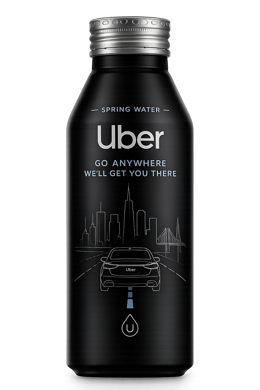
              Every can on the circuit is venue-tagged, variant-tagged, and time-tagged. Uber's growth team gets <b>a real A/B environment in the field</b> — not a dashboard hypothesis. Which incentive lifts new-rider acquisition? Which converts to Uber One? Which drives an Eats order on the way home? Test it across the circuit. Adjust on the next production run.
            </p>
          </Reveal>
        </div>

        <div className="ab-grid">
          {variants.map((v, i) => (
            <Reveal delay={i * 80} key={v.id}>
              <div className={"ab-card" + (v.lead ? " lead" : "")} style={{ "--tint": v.tint }}>
                <div className="ab-card-top">
                  <div className="ab-tag">{v.label}</div>
                  {v.lead ? <div className="ab-pill-lead">HEADLINE</div> : <div className="ab-tag" style={{ color: "var(--t-4)" }}>FIELD ARM</div>}
                </div>
                <div className="ab-can-wrap" style={{ "--tint": v.tint }}>
                  <img src="assets/uber_can_front.png" alt={"Variant " + v.id + " can"} />
                </div>
                <div className="ab-band" style={{ background: v.tint }}/>
                <h3>{v.headline}</h3>
                <div className="ab-line2">{v.sub}</div>
                <div className="ab-tags">
                  {v.tags.map((t) => <span key={t}>{t}</span>)}
                </div>
              </div>
            </Reveal>
          ))}
        </div>

        <Reveal>
          <div className="ab-frame">
            <div className="ab-frame-cell">
              <div className="ab-frame-k">TAGGED BY</div>
              <div className="ab-frame-v">Venue + variant + time</div>
              <div className="ab-frame-sub">Every scan attributable, no exceptions.</div>
            </div>
            <div className="ab-frame-cell">
              <div className="ab-frame-k">CONTROL</div>
              <div className="ab-frame-v">Uber growth team</div>
              <div className="ab-frame-sub">Swap variants between print runs — within season.</div>
            </div>
            <div className="ab-frame-cell">
              <div className="ab-frame-k">DESTINATION</div>
              <div className="ab-frame-v">Uber warehouse</div>
              <div className="ab-frame-sub">First-party. No middleware. No detour.</div>
            </div>
            <div className="ab-frame-cell">
              <div className="ab-frame-k">READOUT</div>
              <div className="ab-frame-v">Weekly · cohorted</div>
              <div className="ab-frame-sub">Re-allocate spend toward the winning arm.</div>
            </div>
          </div>
        </Reveal>

        <Reveal>
          <div className="ab-closer">
            <div style={{ fontFamily: "var(--f-mono)", fontSize: 11, letterSpacing: "0.16em", color: "var(--t-4)" }}>
              CAPABILITY BUILT-IN
            </div>
            <div className="ab-closer-q">
              The pitch site can ship with one default unlock. <span>The infrastructure already supports all three arms.</span>
            </div>
          </div>
        </Reveal>
      </div>
    </section>
  );
}

// ============================================================
// MATH
// ============================================================
function MathSection() {
  const m = window.EXPERIENTIAL_COMP;
  return (
    <section className="section section--light" id="math">
      <style>{`
        .math-top {
          display: grid;
          grid-template-columns: 0.85fr 1.15fr;
          gap: clamp(32px, 6vw, 80px);
          align-items: end;
          margin-bottom: 56px;
        }
        .math-h {
          font-family: var(--f-display);
          font-weight: 600;
          font-size: clamp(34px, 4.6vw, 64px);
          letter-spacing: -0.025em;
          line-height: 1.02;
          color: var(--ink);
        }
        .math-sub { color: var(--tk-2); font-size: clamp(16px, 1.2vw, 19px); line-height: 1.5; max-width: 540px; }

        .math-grid {
          display: grid;
          grid-template-columns: 1.4fr 1fr;
          gap: clamp(32px, 5vw, 64px);
          align-items: start;
        }
        .math-table {
          border: 1px solid var(--line-ink);
          border-radius: 12px;
          overflow: hidden;
        }
        .math-row {
          display: grid;
          grid-template-columns: minmax(0, 1.7fr) repeat(5, minmax(0, 1fr));
          gap: 0;
        }
        .math-row + .math-row { border-top: 1px solid var(--line-ink); }
        .math-th, .math-td {
          padding: 16px 14px;
          font-size: 13px;
          color: var(--tk-2);
          border-right: 1px solid var(--line-ink);
          display: flex;
          align-items: center;
        }
        .math-th:last-child, .math-td:last-child { border-right: none; }
        .math-th {
          font-family: var(--f-mono);
          font-size: 10px;
          letter-spacing: 0.15em;
          text-transform: uppercase;
          color: var(--tk-3);
          background: var(--paper-2);
        }
        .math-row.primary .math-td {
          background: var(--ink);
          color: var(--t-1);
          border-right-color: var(--line-strong);
        }
        .math-row.primary .math-td:first-child {
          font-family: var(--f-display);
          font-weight: 600;
          font-size: 15px;
          letter-spacing: -0.01em;
        }
        .math-row.muted .math-td { color: var(--tk-3); }
        .math-row.muted .math-td:first-child { color: var(--tk-2); font-weight: 500; }

        .math-unit {
          padding: 28px 28px 32px;
          border: 1px solid var(--line-ink);
          border-radius: 12px;
          background: var(--paper-2);
        }
        .math-unit-k { font-family: var(--f-mono); font-size: 10px; letter-spacing: 0.16em; color: var(--tk-3); margin-bottom: 16px; }
        .math-unit-row { display: flex; justify-content: space-between; padding: 14px 0; border-bottom: 1px dashed var(--line-ink); }
        .math-unit-row:last-child { border-bottom: none; }
        .math-unit-row b { font-family: var(--f-display); font-weight: 600; color: var(--ink); letter-spacing: -0.01em; }
        .math-unit-row span { color: var(--tk-3); font-size: 14px; }
        .math-callout {
          margin-top: 18px;
          padding: 14px 16px;
          background: var(--ink);
          color: var(--t-1);
          font-family: var(--f-mono);
          font-size: 12px;
          letter-spacing: 0.05em;
          line-height: 1.5;
          border-radius: 8px;
        }

        @media (max-width: 1000px) {
          .math-top, .math-grid { grid-template-columns: 1fr; }
          .math-row { grid-template-columns: minmax(0, 1.6fr) minmax(0, 1fr) minmax(0, 1fr); }
          .math-th:nth-child(n+4), .math-td:nth-child(n+4) { display: none; }
        }
      `}</style>
      <div className="container">
        <Reveal>
          <div className="eyebrow" style={{ marginBottom: 32, color: "var(--tk-3)" }}>THE MATH</div>
        </Reveal>
        <div className="math-top">
          <Reveal>
            <h2 className="math-h">$2.00 per touchpoint.<br/>The cheapest hand in marketing.</h2>
          </Reveal>
          <Reveal delay={120}>
            <p className="math-sub">
              At anchor scale, the Ape × Uber line item is a vanishingly small fraction of Uber's sales & marketing spend — and the only one in that budget that puts the brand in someone's hand at the moment they're deciding how to move.
            </p>
          </Reveal>
        </div>
        <div className="math-grid">
          <Reveal>
            <div className="math-table">
              <div className="math-row">
                {m.cols.map((c) => <div className="math-th" key={c}>{c}</div>)}
              </div>
              {m.rows.map((r) => (
                <div className={"math-row " + (r.tone || "")} key={r.label}>
                  <div className="math-td">{r.label}</div>
                  {r.values.map((v, i) => <div className="math-td" key={i}>{v}</div>)}
                </div>
              ))}
            </div>
          </Reveal>
          <Reveal delay={100}>
            <div className="math-unit">
              <div className="math-unit-k">UNIT ECONOMICS · VALIDATION PILOT</div>
              <div className="math-unit-row"><span>Cans deployed</span><b>50,000</b></div>
              <div className="math-unit-row"><span>Cost per can, all-in</span><b>$2.00</b></div>
              <div className="math-unit-row"><span>Pilot fee</span><b>$100,000</b></div>
              <div className="math-unit-row"><span>Anchor (Year 1) fee</span><b>$300,000</b></div>
              <div className="math-unit-row"><span>Anchor cans / year</span><b>150,000</b></div>
              <div className="math-unit-row"><span>% of Uber S&M (illustrative)</span><b>~0.005%</b></div>
              <div className="math-callout">
                The pilot fee is roughly one in-app push campaign's media budget.<br/>
                The anchor fee is a rounding error against any of Uber's existing marketing line items.
              </div>
            </div>
          </Reveal>
        </div>
      </div>
    </section>
  );
}

// ============================================================
// ANCHOR NETWORK
// ============================================================
function AnchorNetwork() {
  const stats = [
    { k: "PREMIER VENUES", v: "8+",     sub: "Anchor circuit · NorCal first" },
    { k: "ANNUAL EVENTS",  v: "200+",   sub: "Concerts, festivals, brand activations" },
    { k: "ATTENDANCE",     v: "1.5M+",  sub: "Concourse-passing eyeballs / year" },
    { k: "POUR-RIGHTS",    v: "Live",   sub: "Hydration stations & concourse retail" },
  ];
  return (
    <section className="section" id="anchor">
      <style>{`
        .anch-top { display: grid; grid-template-columns: 1fr 1fr; gap: clamp(32px, 6vw, 80px); align-items: end; margin-bottom: 56px; }
        .anch-h { font-family: var(--f-display); font-weight: 600; font-size: clamp(34px, 4.6vw, 64px); letter-spacing: -0.025em; line-height: 1.02; text-wrap: balance; }
        .anch-h em { font-style: normal; color: var(--t-3); font-weight: 500; }
        .anch-sub { color: var(--t-2); font-size: clamp(16px, 1.2vw, 19px); line-height: 1.55; max-width: 520px; }

        .anch-stats {
          display: grid;
          grid-template-columns: repeat(4, 1fr);
          background: var(--ink-2);
          border: 1px solid var(--line);
          border-radius: 16px;
          overflow: hidden;
        }
        .anch-stat { padding: 32px 28px; border-right: 1px solid var(--line); }
        .anch-stat:last-child { border-right: none; }
        .anch-stat-k { font-family: var(--f-mono); font-size: 10px; letter-spacing: 0.16em; color: var(--t-4); margin-bottom: 14px; }
        .anch-stat-v { font-family: var(--f-display); font-weight: 700; font-size: clamp(40px, 4.5vw, 64px); letter-spacing: -0.03em; line-height: 1; color: var(--t-1); }
        .anch-stat-sub { margin-top: 12px; font-size: 13px; color: var(--t-3); line-height: 1.4; }

        .anch-cards { margin-top: 56px; display: grid; grid-template-columns: 1fr 1fr; gap: 24px; }
        .anch-card {
          padding: 36px 32px;
          border: 1px solid var(--line);
          border-radius: 18px;
          background: linear-gradient(180deg, rgba(255,255,255,0.025), rgba(255,255,255,0));
        }
        .anch-card-k { font-family: var(--f-mono); font-size: 11px; letter-spacing: 0.18em; color: var(--t-3); margin-bottom: 16px; }
        .anch-card h3 { font-family: var(--f-display); font-weight: 600; font-size: 26px; letter-spacing: -0.018em; margin: 0 0 14px; }
        .anch-card .body { color: var(--t-2); font-size: 15px; line-height: 1.55; }

        @media (max-width: 880px) {
          .anch-top { grid-template-columns: 1fr; }
          .anch-stats, .anch-cards { grid-template-columns: 1fr 1fr; }
          .anch-stat:nth-child(2) { border-right: none; }
          .anch-stat:nth-child(-n+2) { border-bottom: 1px solid var(--line); }
        }
        @media (max-width: 540px) {
          .anch-stats, .anch-cards { grid-template-columns: 1fr; }
          .anch-stat { border-right: none; border-bottom: 1px solid var(--line); }
          .anch-stat:last-child { border-bottom: none; }
        }
      `}</style>
      <div className="container">
        <Reveal>
          <div className="eyebrow" style={{ marginBottom: 32 }}>THE ANCHOR NETWORK</div>
        </Reveal>
        <div className="anch-top">
          <Reveal>
            <h2 className="anch-h">Operating today.<br/><em>Premier California venues.</em></h2>
          </Reveal>
          <Reveal delay={120}>
            <p className="anch-sub">
              Live distribution, live pour-rights, live concourse placement — across the premier outdoor amphitheatre tier. The anchor circuit is the inaugural deployment. National venue-operator circuits expand in Stage 03.
            </p>
          </Reveal>
        </div>
        <Reveal>
          <div className="anch-stats">
            {stats.map((s) => (
              <div className="anch-stat" key={s.k}>
                <div className="anch-stat-k">{s.k}</div>
                <div className="anch-stat-v">{s.v}</div>
                <div className="anch-stat-sub">{s.sub}</div>
              </div>
            ))}
          </div>
        </Reveal>
        <div className="anch-cards">
          <Reveal>
            <div className="anch-card">
              <div className="anch-card-k">PILOT</div>
              <h3>Single anchor circuit.</h3>
              <div className="body">
                50,000 cans across the premier California venue tier. 90 days, peak season. One funnel-attribution model proven before scale.
              </div>
            </div>
          </Reveal>
          <Reveal delay={100}>
            <div className="anch-card">
              <div className="anch-card-k">ANCHOR · YEAR 1</div>
              <h3>The full California season.</h3>
              <div className="body">
                150,000 cans across 12 months. Multi-variant A/B/C running concurrently. Category-exclusive — no other rideshare brand competes on the same surface.
              </div>
            </div>
          </Reveal>
        </div>
      </div>
    </section>
  );
}

// ============================================================
// SCOPE
// ============================================================
function Scope() {
  const s = window.SCOPE;
  return (
    <section className="section section--light" id="scope">
      <style>{`
        .scope-top { margin-bottom: 56px; max-width: 720px; }
        .scope-h { font-family: var(--f-display); font-weight: 600; font-size: clamp(32px, 4.4vw, 60px); letter-spacing: -0.025em; line-height: 1.02; color: var(--ink); text-wrap: balance; }
        .scope-sub { margin-top: 18px; color: var(--tk-2); font-size: 17px; line-height: 1.5; }
        .scope-grid { display: grid; grid-template-columns: 1fr 1fr; gap: clamp(24px, 4vw, 48px); }
        .scope-col {
          border: 1px solid var(--line-ink);
          border-radius: 16px;
          padding: 32px 28px;
          background: var(--paper);
        }
        .scope-col-k { font-family: var(--f-mono); font-size: 11px; letter-spacing: 0.18em; color: var(--tk-3); margin-bottom: 14px; }
        .scope-col h3 { font-family: var(--f-display); font-weight: 600; font-size: 22px; letter-spacing: -0.015em; margin: 0 0 24px; color: var(--ink); }
        .scope-col.dark { background: var(--ink); border-color: var(--ink); }
        .scope-col.dark .scope-col-k { color: var(--t-3); }
        .scope-col.dark h3 { color: var(--t-1); }
        .scope-col.dark li { color: var(--t-2); }
        .scope-col.dark .scope-ico { background: rgba(255,255,255,0.08); color: var(--t-2); }
        .scope-col ul { list-style: none; padding: 0; margin: 0; display: grid; gap: 14px; }
        .scope-col li { display: flex; align-items: flex-start; gap: 12px; font-size: 15px; color: var(--tk-2); line-height: 1.4; }
        .scope-ico {
          flex-shrink: 0;
          width: 22px; height: 22px;
          border-radius: 999px;
          background: var(--paper-3);
          color: var(--tk-2);
          display: flex; align-items: center; justify-content: center;
          margin-top: 1px;
        }
        @media (max-width: 880px) { .scope-grid { grid-template-columns: 1fr; } }
      `}</style>
      <div className="container">
        <Reveal>
          <div className="eyebrow" style={{ marginBottom: 32, color: "var(--tk-3)" }}>SCOPE</div>
        </Reveal>
        <Reveal>
          <div className="scope-top">
            <h2 className="scope-h">Tight scope, by design.</h2>
            <p className="scope-sub">
              This is a narrow, additive program — not a takeover of anything Uber already does. Two lists keep it that way.
            </p>
          </div>
        </Reveal>
        <div className="scope-grid">
          <Reveal>
            <div className="scope-col">
              <div className="scope-col-k">SIX THINGS WE'LL NEVER TOUCH</div>
              <h3>Out of scope. On purpose.</h3>
              <ul>
                {s.neverTouch.map((t, i) => (
                  <li key={i}>
                    <span className="scope-ico"><Icon name="x" size={12}/></span>
                    <span>{t}</span>
                  </li>
                ))}
              </ul>
            </div>
          </Reveal>
          <Reveal delay={100}>
            <div className="scope-col dark">
              <div className="scope-col-k">SIX PLACES THE DATA LIVES</div>
              <h3>Uber's systems. Nowhere else.</h3>
              <ul>
                {s.dataLives.map((t, i) => (
                  <li key={i}>
                    <span className="scope-ico"><Icon name="check" size={12}/></span>
                    <span>{t}</span>
                  </li>
                ))}
              </ul>
            </div>
          </Reveal>
        </div>
      </div>
    </section>
  );
}

Object.assign(window, { ABTesting, MathSection, AnchorNetwork, Scope });
